This is a solution for implementing color themes with tailwind. It makes use of CSS variables which are great providing that you don't need to support IE11.
// tailwind.config.js
module.exports = {
  theme: {
    colors: {
      teal: {
        100: "var(--color-teal-100)",
        200: "var(--color-teal-200)",
        // and so on...
      },
    },
  },
}
Those CSS variables that are referenced in the tailwind.config.js file then need to be created in CSS. With tailwind, your instinct might be to avoid CSS files altogether but I think of defining these variables more as configuration.
:root {
  --color-teal-100: #55d3b8;
  --color-teal-200: #2c947e;
}

.funky-theme {
  --color-teal-100: #80f7dd;
  --color-teal-200: #5dd6bc;
}
Anything under :root would be the default theme. To apply the funky-theme the class is used on a parent element then any children will use that theme.
<body>
  <span class="text-teal-100">Pretty default themed in here</span>
  <section class="funky-theme">
    <span class="text-teal-100">All funky themed in here<span>
  </section>
</body>
Primary, secondary (etc) approach
The last approach where we had CSS variables for specific colors like teal-100 might not be that useful when your themes actually use very different colors. It wouldn't be ideal to have to override teal-100 with a red color.
Instead, you can name colors more generically.
// tailwind.config.js
module.exports = {
  theme: {
    colors: {
      primary: "var(--color-primary)",
      secondary: "var(--color-secondary)",
      // and so on...
    },
  },
}
:root {
--color-primary: theme("colors.teal.100");
--color-secondary: theme("colors.yellow.500");
}
.funky-theme {
--color-primary: theme("colors.red.800");
--color-secondary: theme("colors.green.500");
}Most likely with theming (e.g dark theme) this approach is going to be more useful.
A real-world example
I used this pattern for the theming on a "website builder" app where I wanted to use tailwind both for the "configuration" section and the "website preview" sections of the page.
I wanted each section to be independent so that the built websites colors didn't get mixed up with the branding colors for the main application.
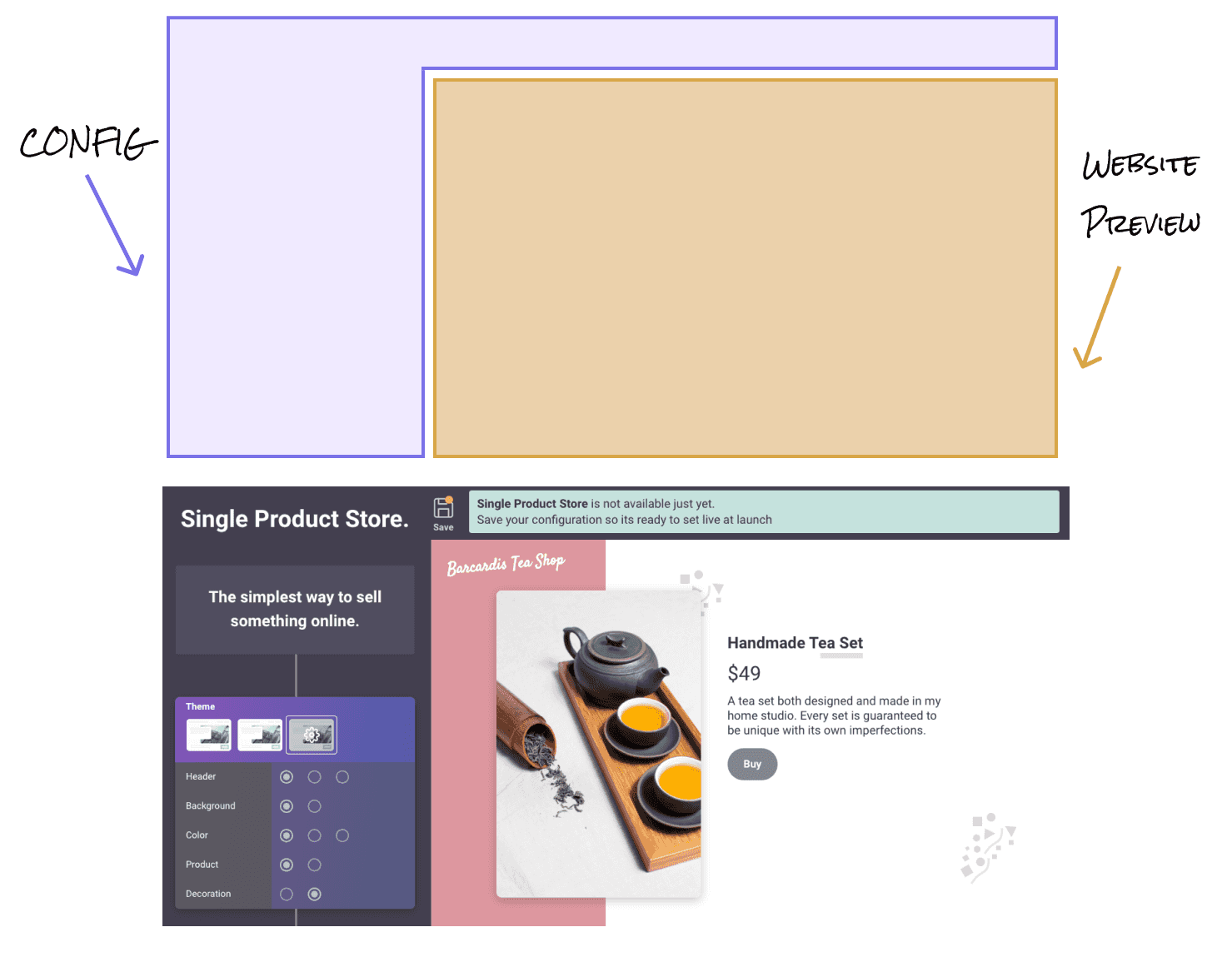
Similar to the examples earlier in the post I used both a :root theme and a website-preview theme.
<body>
  <section>
    <h1>Single Product Store</h1>
    <!-- This uses the default :root color theme -->
  </section>
  <section class="website-preview">
    <h1>Barcardis Tea Shop</h1>
    <!-- This uses "website-preview" color theme -->
  </section>
</body>